A clearer position in business automation.
Brand foundation
An updated proposition and visual language for explaining the automation business, with a shared direction for communications and brand applications.
See the project
The project
bpm needed a clearer way to explain its role as a business automation partner. We updated the brand platform around a central idea: helping businesses remain resilient through change.
The market had changed, competition had intensified and many providers were making similar promises. The company needed a point of difference that reflected its expertise in complex systems and its ambition to work with clients across different sectors and business sizes.

The platform centres on “Automating change”. It connects technical expertise with the business reason for choosing the company: managing complexity and helping clients adapt when conditions change.
Partnership and collective intelligence support that position. They describe how the team works with clients, shares knowledge and takes responsibility throughout a project. Brilliance, passion and mastery define the brand character and give the initials bpm an additional meaning beyond process management.
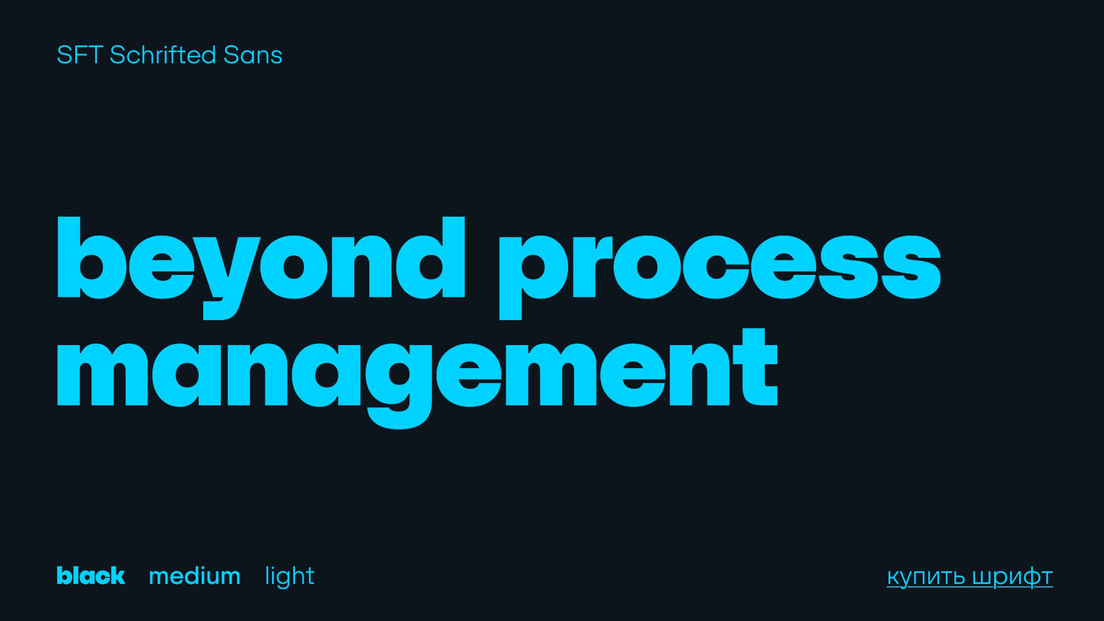
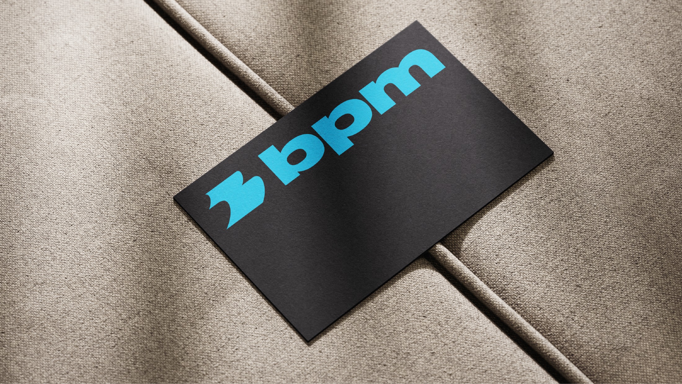
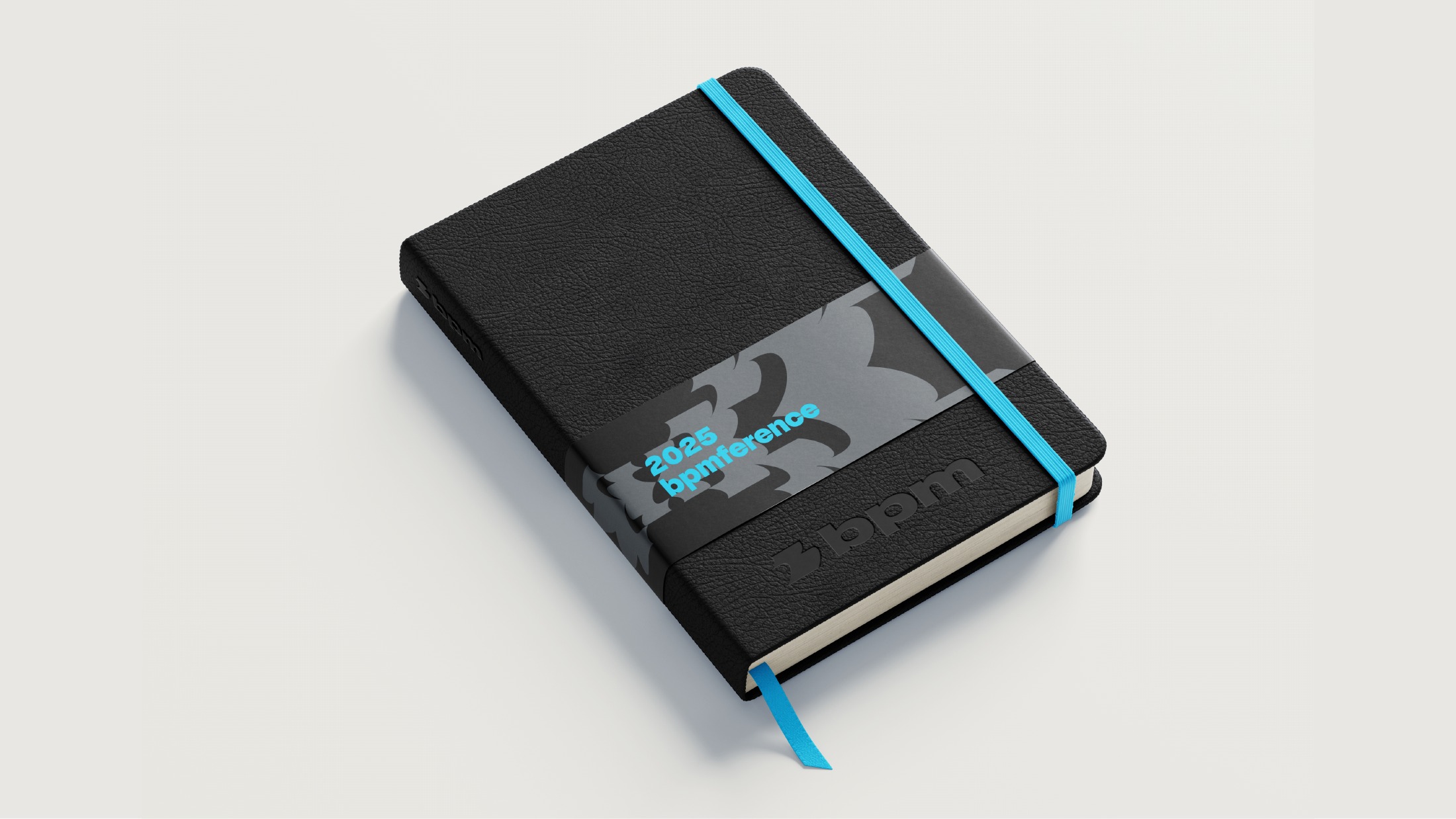
The visual identity combines a compact symbol and wordmark with a dark navy and cyan palette. The symbol becomes a graphic element that can repeat, change scale and form patterns. Typography and application concepts show how the system works across communication materials.
The applications shown here are design concepts, not evidence of a completed rollout.